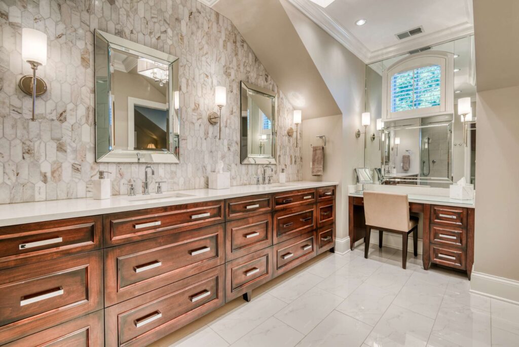
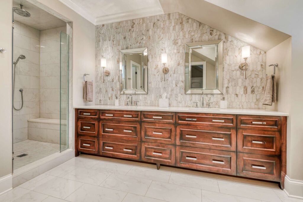
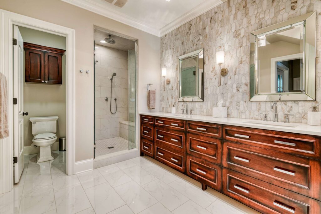
The client wanted a more open space with larger vanities that look like furniture. By removing one wall, converting the tub area to a make-up counter and adjusting the entrance location, our design dramatically expanded the master bathroom, creating a spa like getaway for the client.
By removing one wall, converting the tub area to a make-up counter and adjusting the entrance location, our design dramatically expanded the master bathroom, creating a spa like getaway for the client. The client loves the mix of traditional and contemporary together. We selected a stunning chandelier to add drama in the space
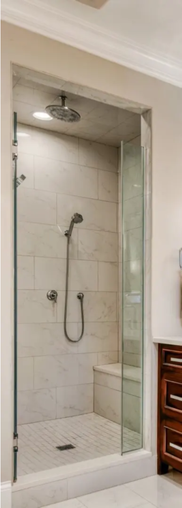
The shower stayed in place and was refreshed with new tile and dual function fixtures. We designed a stone tile backdrop behind the vanities with wall mounted mirrors, which has the effect of increasing the size of the room.
Dual-function fixtures were added along with a new bench seat for increased use and comfort.
The makeup counter at seated height is slightly lower than the vanities and is nestled under an arched window where the bathtub used to reside. We used a wall to wall mirror and added a custom beveled edge to mimic the design of the mirrors over the vanities. The wall to wall mirrors expanded the visual size of the room. This made an otherwise awkward window look attractive
The removal of the bathtub and a wall allowed room for a 72 in vanity, a 10-foot vanity, and a makeup counter with wall to wall mirrors. . The client loves the mix of traditional and contemporary together. We selected a stunning chandelier to add drama in the space.
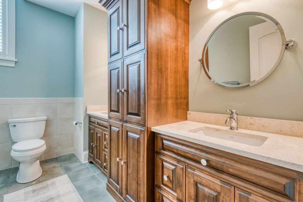
The kid’s bath was updated with new fixtures, finishes, lighting and mirrors to complement the rest of the upstairs.
![Interior Planning Logo v6 A Red[1] copy Interior Planning Logo v6 A Red[1] copy](https://interiorplanning.com/wp-content/uploads/2020/06/Interior-Planning-Logo-v6-A-Red1-copy.png)
